Printing Articles from Bright Print Group
We offer useful printing articles to our clients and also the latest Bright Print News, events and community projects. We stay on top of industry developments and we celebrate our industry awards.
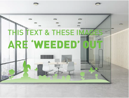
We often see artwork on windows, walls, vehicles and other surfaces where the text and images are ‘cut out’ before being applied to the surface, leaving the background clear. Below are two scenarios where both artwork files were printed on white vinyl. Each file was prepared differently, which resulted in very different end results.
Bright Print Group offers fast, reliable digital printing for Sydney, NSW, organisations. Call (02) 9757 3000 now to streamline your next marketing campaign.
We often use two types of black when designing artwork. Standard 100% black and ‘rich black’ . When we use rich black, a percentage of cyan, magenta and/or yellow ink is mixed with the black. The additional saturation of colour creates a rich black that will print darker than black ink alone. It is very important to use the correct ‘black’ when designing. ‘Black’ colour swatches can appear to look the same on screen. However, setting up and using the wrong type of black can result in artwork printing incorrectly. The following examples present some common design scenarios and solutions for dealing with colour issues involving black. EXAMPLE 1: Black Backgrounds and Images
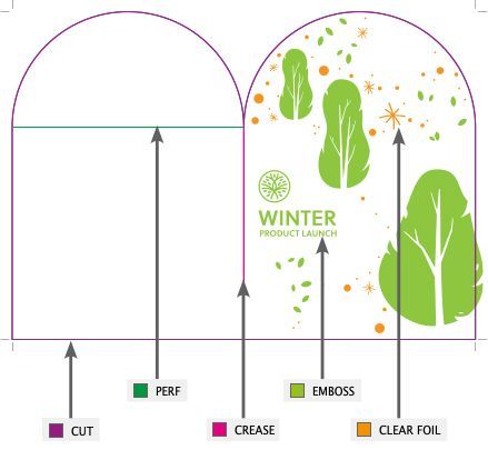
Setting up layers, spot colours and overprinting in artwork.
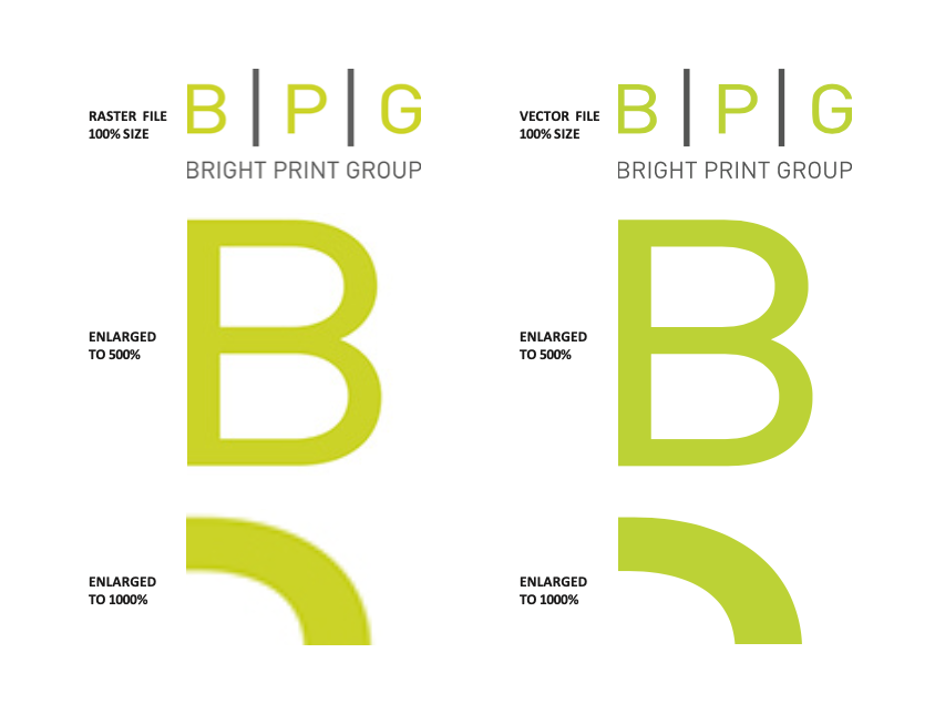
Distinguishing between raster and vector formats is important for print because they are different in how they store information and form the visual that is your digital graphic.
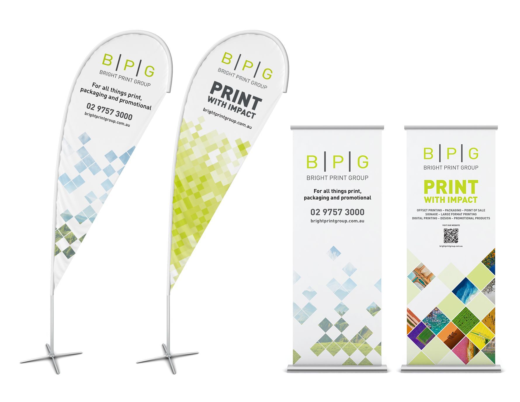
Portable banners and flags are the perfect display tool for marketing at exhibitions, conferences, trade shows, product launches and shop fronts. They are used to grab attention, drive traffic, and promote businesses or events by leveraging their high visibility and cost-effectiveness as a marketing tool. In addition, they can be placed indoors and outdoors.
To speak with our printing team, reach out to us on (02) 9757 3000.